Friday, August 3, 2012

what am i up to these days?

i've been getting that question a lot. from friends, family, past acquaintances, etc. it's kind of a tedious conversation for me - just like those who dread discussing with strangers on airplanes or trains what they do for a living.


for the past month now, i've been out in cupertino, ca for an internship with apple. ever felt like you were out of your league? like you had no idea what you are doing? that's basically how i felt for a while. but at the same time, i'm learning a lot about both myself and the kind of work i want to pursue. everyone i've met so far has always been amazingly supportive. exactly what am i doing? unfortunately, i can't really say.


for those of you who have the same misconceptions i did, the apple campus is not in one central location. rather, it is actually comprised of numerous spots dotted around the city. of course, there's the main campus at infinite loop where all the tour buses stop by. but there are also a whole network of offices on various streets around cupertino and san jose. 


stopped by one infinite loop my first day to get my badge photo taken. there's also a company store here where you can buy all sorts of apple branded merchandise.


my corporate badge. they allow props for your photo, so i packed quidditch goggles and a little robot especially for that purpose. #nerdwin


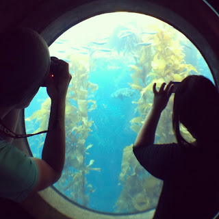
some non-cupertino photos. spent the weekend at monterey bay with two coworkers, one of whom is also a kcai grad! 


Wednesday, July 14, 2010

city 17:: conceptualizing


First round for my current project, "city 17."

Wednesday, March 24, 2010

dp::motion tests


Untagged - test1 from Sheila Wong on Vimeo.

Initial motion test. Still needs a lot of revising, but the idea of the elements 'growing' from each other is something I'd like to keep working with.


Monday, March 22, 2010

dp::refining, iterating

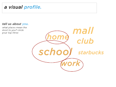
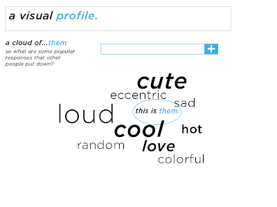
I've been working on a 'tagging' system which uses a common toolset, but presents a distinct difference between when users tag themselves versus tagging brands. For the self tagging, I worked with a circular arrangement of words.

When tagging brands, the tag clouds are presented in a more modular arrangement. Here, inputed words brand off from one another, depending on the connotation of the word itself.


Additionally, a motion graphics element is something I'm looking to incorporate into this project as well. Some sketches on possibly compositions and layouts. I also think I need some other typeface than just simply Serifa.


Wednesday, March 10, 2010

dp::mid semester summation


At the beginning of this project, I originally was looking into how we could encourage creativity among high school students. But once I began interviewing and taking surveys of my demographic, I soon realized that the research question needed to be severely refined. Of the eventual forty-five students I spoke and/or surveyed, a startling amount of them had a similar dependancy on brand names.

When asked to define themselves, or what they saw as "identity," a large percentage of the students often brought up name brand items and clothing. But when asked why, they couldn't give any definitive answers.
It was at this point that I began to realize that we cannot encourage creativity unless we first understand what stymies it. And thus I began to do research about brand literacy, or the understanding of how messages are analyzed, evaluated and created. As a designer, I've worked in projects where the objective was to create a brand as well, ones where I've had to carefully consider the kinds of qualities and information I was sending to the audience.


I ran into no shortage of dead ends through different prototypes and experiments, but each iteration left me with different things I would need to consider later on. For a while I focused on the idea of a quiz/game where one could input information about themselves, and it would generate an infographic of sorts for them to keep. But while this idea could possibly motivate students to try it, it lacked dimension and an incentive for longer-term involvement.


For the past few days, I've been building a web-based community that I've dubbed, Untagged. (I'm still open for better names) Untagged seeks to educate its users about the variety of messages that brand names seek to convey to consumers.
One of the two main features is the "tagging" system. Basically,  you are presented with a brand name and/or logo, and can tag it with words and adjectives of how you perceive the brand. I'll be continuing with this direction in the coming weeks - but I'm very optimistic about the possibilities that Untagged could have.

Monday, March 8, 2010

spatial exp::kc auto show

01 - practical signage.


02 - Are rainbows poetic?


03 - I suppose nothing is more persuasive to their target demographic than a woman talking about a nice car. Well, she was definitely more persuasive than the majority of the car dealers.


For me, this was by far the most persuasive element. I'd buy a car if it came with that dress.

Friday, March 5, 2010

pro practice::finished portfolio site


My finished web portfolio. Still need to finesse the layout of the portfolio elements.


Thursday, February 25, 2010

pro practice::portfolio website

Got all the code up and running, just need to drop in the portfolio pieces now.
A very close version of the wireframe I made in Multimedia Experience, except some of the navigational elements were moved around, and I changed the sorting method from years to media type.

Wednesday, February 24, 2010

dp::small group notes

User Incentives:

  • Personalized space
  • comparison to others
  • new content / updates
  • what is important
  • connect to similar people
  • matching users? potential friends
  • home profile page
  • sharing facts
  • what they can do to grow
  • pair brand literate with someone who isn't
  • embrace what they like
  • encourage dialogue between opposites.

Personality Test Drive / Mentality
  • Subjective validation
  • Narcissistic personality inventory
  • Most personality quizzes are only roughly 50% accurate.
  • Many users don't answer honestly; fear of a negative 'score.'
  • Popular at end of the year (New Year's resolutions?)

Quiz/Test Motivations:
  • Self interest / Self discovery
  • How can they fix what's wrong with them?
  • How can they get along better with people?
  • Entertainment
  • Comparison

mousepath::day 003

Day 03: Pro Practice, Degree Project
Some more workin' in Illustrator today. About ten minutes after I started the app.


Progression throughout the day. Did a number of small group critiques today, hence the denser collection of dots.
Apparently the application I click most often on my dock is iTunes. Hmm.

Tuesday, February 23, 2010

adobe photoshop COOK ::find+share


What if Photoshop could be used to cook? An awesome stop-motion video of cookies being made in Photoshop.

Monday, February 22, 2010

dp::initial icon sketches + interactivity wires


Critique Notes:

  • What keeps the user(s) interested?
  • What could make it more than a one-time experience?
  • Longer life span?
  • Working towards something else?
  • Educated the users, now what?
  • Is there a call to action?
  • SO WHAT? and LONGEVITY
  • Encourage change and commitment
  • Brand literacy
Interface/User Experience Notes:
  • Develop visual indicators
  • Size of circle = priority
  • Play up interactions
  • Immediate user feedback
  • Make it interesting/fun to fill out
  • Shows off users' skills?
  • Different iterations
  • Toggle between self, friends and others
  • Sorting
Other Considerations
  • Facebook/Myspace quizzes
  • WHY do they take these quizzes?
  • Self interest
  • More visual
  • IQ Tests
  • Self discovery?
  • Iterate, innovate

mousepath::day 002

Day 02 - Spatial Experience, Degree project

8:49am


Progression throughout the day:


Do I really rest my mouse that much? And here I thought I was constantly in motion.

Wednesday, February 17, 2010

dp::a visual prototype

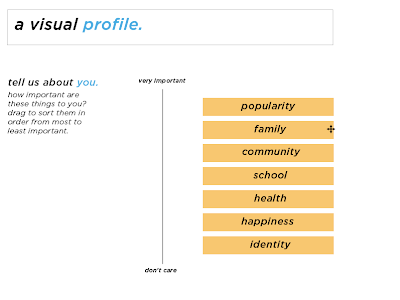
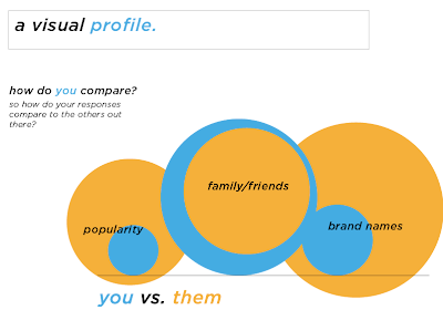
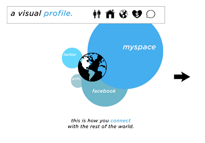
Interactive model, used information from surveys I distributed to my target audience.


Some notes from critique:


Revise:
  • Research question
  • ICONS


  • Where do I want to be?
  • Interactivity of the circles? (Draggable?)
  • Customization, more levels
  • Plug in your own info, affects the infographics
  • You vs. general masses


Icons:
  • Individuality
  • Unique icon set
  • Appropriate connotations
  • Attributes
  • Attitude


  • fun vs. generic
  • Broader functionality?
  • Break down more?
  • Strategy?
  • Plotted vs. general public.
  • Educate

mousepath::day 001

A small experiment I'm starting on the side. Using Anatoly Zenkov's mousepath code, I'm tracking my mouse's movements throughout the course of the day. (There's a link above to the script, if you want to try it for yourself!)


Day 01: pro practice, lunch, degree project

(Note: large black dots indicate points where the mouse rested for a period of time. So the larger the dot, the longer the duration.)

(9:25am - 12:02pm)
Lots of movement to the upper right corner! Most likely because of expose'.

Thursday, February 11, 2010

pro practice:: three surprises (web design)

1.) Motion graphics may be billed as high as $10,000 per on-screen minute.

2.) When pitching to design a website, a designer may need to hire consultants on creative deliverables such as mood boards, Photoshop comps, or Flash files and determine if a style guide is needed.

3.) Usually pays around $50 an hour.

Tuesday, February 9, 2010

dp::timeline + media literacy


How can an interactive web-based community empower high school students to break from commercial mass production and develop their own unique visual identities?

High school students are my primary audience for this project, but can include  college freshmen as well. Students in this grade range are developing their own sense of identity, specifically who they are, their likes and dislikes, etc.  Regardless of whether or not we admit it, we are all influenced by something. But all people these days are influenced by one main force: the media. Teenagers are often their main focus because they're still developing their own ideas and are slowly allowing those thoughts to steer their lives in the direction of their choice. ("Virgins of thought" some call them.) One major example of media manipulation is the idea of "having a right look."

During my initial round of surveys, I asked high school students: "What does identity mean to you?" and "What do you associate with identity?" OR "What are you favorite brands?" and "WHY do you buy the brand names you do?"
A majority of their responses were often directed towards material objects that they desired: Louis Vuitton purses, Gucci accessories, clothing, etc. Acquiring these name brands seemed to be an important goal for them. A survey of magazines and/or blogs they subscribed to consisted of numerous fashion publications, etc. The problem here seems to be a lack of media literacy. Media literacy is the process of analyzing and evaluating messages in their wide variety of forms. It helps to encourage people to ask questions about what they watch, hear, and read. More importantly, an understanding of the media can help students critically analyze messages to detect propaganda, censorship and bias.

So how can design help to teach teenagers about media manipulation and encourage them to become more visually literate? In order to achieve this, I plan on developing an interactive community which can help to educate teens about the media, and encourage them to forge their own identities. I want this to be more than just a collection of educational articles though. I want the final artifact to facilitate dialogue between its readers, and encourage the exchange of independent ideas.

Wednesday, February 3, 2010

dp::more prototyping


A quick prototype worked up for one of my user experiments.

Tuesday, February 2, 2010

pro practice::dream job

Writing down my "dreams" in life has always been a difficult thing to fully articulate. 
A lot of my interests and desires often differ from season to season, but perhaps the most important thing I hope to avoid is being stuck doing the same thing. I don't want to be designing the same type of projects, until the major I'm interested in becomes nothing but a chore. But in regards to graphic design, I'm very interested in web and interactive graphics, and would love to end up with it as the focus of my career. With room for other things, of course. That's one of the things that drew me to graphic design in the first place, it's versatility. When we think about it, what ISN'T design?

As far as my own geographic location goes, I've always wanted to move towards the coast. (East or west is fine) Since my stay in Boston a year ago, I've become enamored with dense cities and their transit systems. Especially they're transit systems. Whereas native Bostonians often dreaded the morning commute, I enjoyed the simple act of traveling around. Although I suspect if I were to reside there, it would grow old quickly.
Also, the Museum of Science in Boston has a design internship program I wanted. But apparently, I need more "of a background in science." Okay.
I once came upon a small store that was literally FILLED with books. Nothing but endless piles of them, stacked into aisles, obscuring the single employee and cash register; a bound paper kingdom. If nothing else, I want to fill my apartment with books like that.


For now, I've compiled a list of things I enjoy, and hope that they are part of my future. (Well, some are a given.)
  • earl grey tea
  • scarves
  • subways
  • vinyl toys
  • paint
  • actionscript
  • css
  • maps
  • keys
  • museums
  • flea markets
  • travel
  • tiny books
  • web design
  • food
  • vintage watches
  • snails
  • trains
  • books

Sunday, January 31, 2010

dp::revising the research question, experimentation


Initial Question:
How can an interactive web-based community experience inspire and assist in the creative/artistic endeavors of the Facebook generation for the purpose of promoting an independence from commercial mass production?


Revised question:
How can an interactive web-based community empower high school students to break from commercial mass production and develop their own unique visual / aesthetic / creative identities?


(While at the same time keeping in mind economic factors, potential for change?)


Some considerations:
  • discovering their own identity/political views/aesthetics/
  • identity/views - goals of the designer.
  • create their own identity.
  • empowering a group of non-designers.
  • creating a visual identity?
  • online spaces
  • price ranges/sustainability
  • economical factors
  • focus more towards younger side.
  • something that changes over time / grows along with the user


With these things in mind, I set to working up some experiments.
Oftentimes, one's visual identity is comprised of the objects that we collect and/or use. It is these little choices that we make (what accessories we carry, the color keychain we use, jewelry, etc) that add up to the whole. (I suppose kind of like Gestalt theory?)
I'm very interested in the DIY culture, and the adaptable nature of the projects that can be found on various online communities. With some of these things in mind:


  • How can an interactive activity facilitate dialogue between users?
  • How do the user's interests shape the creative outcome?
  • How can interactive design engage users in an activity?


spatial exp::buildings

I've narrowed down my list of possible buildings for this project to the following two:


1.) Rose Center for Earth and Space (2000)

2.) Fire Island House (1977, Arthur Erickson)

Tuesday, January 26, 2010

dp::research question

How can an interactive web-based community experience inspire and assist in the creative/artistic endeavors of the Facebook generation for the purpose of promoting an independence from commercial mass production?


-a la Ian Tirone


A slight revision:

How can an interactive web-based experience inspire the creative endeavors of Generation X, (or digital natives) for the purpose of promoting independence from commercial mass production?

Friday, December 4, 2009

mx::project two final


This portfolio page is intended as a timeline of sorts. The portfolio has been broken down into several years. When the user clicks on different years, it moves them back and forth over the timeline itself.
I made my site's navigation very minimal, with different colors to designate different years or parts of the portfolio. The clickable thumbnails are points on the timeline, which allows for the different works to be arranged in chronological order.
The part I struggled most with was perhaps the Actionscripting. Well, until TweenLite came into my life. Thank you, Greensock.

Monday, November 30, 2009

mx::reading responses

The Interface: p.63 - 78

In this section of the reading, I was quite fascinated by the connections drawn between graphic interfaces and the design aesthetics established by the Blade Runner movie. In essence, it seems that Macintosh and Blade Runner provided the wireframes for the basic GUI, whereas subsequent companies and/or individuals gave these wireframes the design through which we know them today.

But I was especially interested in the part where the author ruminates on how the role of the computer has changed, from "being a particular technology…to a filter for all culture…" (p.64) But this is by no means surprising, when we consider the nature of technological innovations in general. Condensing many parts into less or even a singular unit seems to be a basic trend as far as new technologies go: think of how modern CD players could play CDs, and tune into radio stations. Or, even more currently, separate CDs versus all the songs being loaded into one iPod. (with room to spare.) So its really not that surprising that our computers today could almost render things such as TVs, radios, calculators, etc obsolete.


Cinema: p.78 - 93
Some interesting points are brought up this section. The author wonders wonders how "a language designed by a rather small group of people that is immediately adopted by millions of computer users." Its not because we're "wired" to this sort of thing. Rather, it is thanks to familiar cultural forms. This reminded me of how high school language teachers often instruct students on new languages. They're often shown images (people, food, animals, etc.) that we can all recognize and through this familiarity taught another way to say "apple", for example.

The section where they talked about how computer games utilize cinematic elements such as the implementation of a dynamic point of view was pretty intriguing as well. It reminded me of childhood days spent playing the Legend of Zelda games. One of the best features of the game's interface was the control over the player's camera angle. A single joystick allowed the user to toggle the angle, and even the proximity to the character. Or, they could even simply press the "Z" button (which later coined the term, "Z-Targeting") to automatically orient the camera to their character's straight-on perspective.
Some games don't allow their users to have too much control over this feature, instead letting the AI attempt to preempt where the user might need to view. This lack of control however, is mostly just frustrating.


The Screen and the User:

I was most interested in this section of the explorations of the screen as something that is "dynamic." The idea of a screen is simple enough. A square/rectangular frame that is essentially a window or portal into a virtual space. There is of course, some suspension of disbelief. (just like in cinema) Our files and documents do not actually folders, icons, etc. Rather these are merely the forms that we interact with them in. All our texts and documents are simply bits and pieces of binary code.
But its definitely true how our "viewing regime" is made possible by the full screen viewing. It's something that we often take for granted or forget entirely; until the resolution is off, or the screen image is misaligned and this break in the illusion becomes glaringly annoying.
The reading goes on to note how historically, the screen has always been a simple rectangular object - one that we view from the comfort of our seats. Thus, I'm very much interested in what happens when this classical window is expanded, into virtually everything around us.


I'd like to make a note at this point on the term "virtual reality." Up until last semester, I was often wary about the term because it sounded so…dated. Instead of technological change and innovation, the term called to mind campy science fiction movies from the early 80s and 90s. Thus, I was happy (relieved?) to find a more suitable alternative when I was looking through some of GE's new site features: "Augmented reality." The phrase certainly has the right connotations. The term "virtual," while true that it implies that it doesn't exist outside of the software, imposes separate boundaries between our world and the simulated. "Augmented" on the other hand implies more of an integration with the real world, with the technology making it something greater than it actually is.

Friday, November 13, 2009

multimedia exp::prototype alternatives


Idea #1:
Layout of the site has been split up into different sections - clicking on the different headers moves the content in from the right, and simultaneously moves the work thumbnails in from the left.


Idea #2:
Moving away from the vertical layout of my original prototype, I arranged the site content into a more open format. The clicking and moving of the user through the page gives the opportunity to see perhaps how the site is composed.


Idea #3:
Reorganized the layout into a horizontal format

Wednesday, November 4, 2009

vis ad::fight back (seniors)


Fight Back: Teaching senior citizens to spot scams/frauds

In an effort to combat the large amount of scams that target senior citizens every year, "Fight Back" encourages awareness and dialogue through informational booklets. This project seeks to educate senior citizens to spot and identify different types of frauds that often target this vulnerable demographic. These booklets are made readily available at no cost for seniors at local pharmacies, nursing homes, etc. The material helps to educate readers about different types of scams: healthcare, telemarketing, online, etc. While they are intended for seniors, people of any age can use it as well.

Monday, November 2, 2009

vis ad::senior thesis considerations

The senior thesis project is a topic that I've been grappling with for quite some time. I’ve written a number of questions that I’ve asked myself: What do I feel passionately about? What message do I want to send about design? Where do I see myself in regards to being an advocate? What is my place in this world as a designer? Do I want to pursue something I’m comfortable with, or try something radically new? But this exercise only engendered more questions than answers. After a time, I came to realize that I'm not much of an advocate of anything. This realization was a sobering one. Like most people, I do care about the state of our environment, and the whole "green" movement, but I wouldn't go so far as to call myself passionate. Our readings in studio have definitely made more aware of issues that we as designers must also consider. The Adbuster article made me realize that we cannot always rely on the clients we work with to set ethical standards. Instead, we have to establish our own. However, as thought-provoking as this proved to be, I don't think I would work with it for an entire semester.
After graduating, I do hope to work with web and interactive graphics. I am deeply fascinated by the level of depth and interaction that can be achieved though flash interfaces, etc. But the coding languages behind it are something of interest as well. (Whether it’s CSS, Ajax, jQuery, simple HTML, Actionscript, etc.)
As a general starting point though, I am avidly interested in new technology and its effects on our design considerations. There are numerous concept platforms on the horizon, many of which could even radically change how we perceive screen-based graphics now. I’ve seen ideas that break past the simple horizontal screen format, and begin to explore more organic to circular forms. There are a lot of designers out there who have been wary how permeated with technology our lives have become. Now, when we design something, we often need to consider how it might appear on a screen as well. Some embrace this. Some run like hell.
But I don't see it as the end of print media. Rather, technology can help to augment our visual experiences. (I’ve often had this “print versus digital” discussion with friends and fellow designers. Discussion has often been heated, often to the point where the two could be likened to archetypal conflicts such as ninjas versus pirates or humans versus mutants.) I’m very hopeful of where we are in design and technology, as well as where this path will eventually lead us as visual artists.