Saturday, February 28, 2009

type iv:: baskerville liquid video

siphoning off the extra ink.


I began this project considering:

1.) How can hand rendered typography be affected by the surface(s) it exists on?
2.) How can it be controlled via the medium used?
3.) "             " transcend the page?
4.) "             "  reflect the designer's unique process?
5.) "             "  have a limited lifespan?

Sunday, February 22, 2009

Monday, February 9, 2009

typeiv - hand rendered type objectives

questions:
  • how can hand rendered typography be temporary?
  • what happens when you apply it to a grid system?
  • how can it raise environmental awareness?
through the study of different examples of hand-rendered typography, I chose to study in particular liquid typography. I was particularly inspired after looking at works/exhibits such as "Typotonic", from a German studio. Water/liquids are a free-form substance. So what happens when you apply it to a gridded system? But the selected medium here is in itself quite temporary - which addresses one of my aforementioned questions.
secondly, i am interested in the numerous ad campaigns around which seek to raise one's awareness of the situation our environment is in. these are almost always predominantly image-focused. which leads me to my third question: how can it raise environmental awareness? namely, how could hand generated typography be just as impactful as an image?


How can hand rendered typography...
  1. bring depth to print?
  2. have more legibility than digital typefaces?
  3. reflect rhetorical devices?
  4. extend the letterform?
  5. reflect an artist's unique process?
  6. have a limited lifespan?
  7. transcend the page?
  8. raise awareness of environmental issues?

Thursday, February 5, 2009

hand rendered typography

Is handmade the new modern? I sure hope so.

The increasingly digital sphere we inhabit is filled with ever-increasing amounts of computer-generated graphics and typography - but hopefully, there are artists whom still don't mind working a bit harder when it comes to letterforms. After going through various blogs and design websites, I encountered numerous examples of hand rendered typography in today's graphic landscape. There's definitely a certain aesthetic to these handmade artifacts - something that can't always necessarily duplicated through digital means. But that doesn't mean we can't combine the digital with the more tactile qualities of handmade elements. Hand rendered type is fairly ubiquitous, and can be found in numerous places; whether it be posters, cd covers, album art, websites, titles, etc. Some of the artists I have found working in this field include Stefan Sagmeister, Ray Fenwick, Mike Perry (author of "Hand Job: a catalog of type."), Hjarta Smarta (did some works with sewn type), and Peter Blake.

Among Sagmeister's work, I was particularly attracted to his recent environmental "Urban Play" piece, which featured type which was made from thousands of euro pennies. While he could have easily made this on the computer, it puts itself onto a new level by being hand-rendered.

Whether or not the audiences we design for realize it, typography conveys mood, information, style, etc. While much of this can be conveyed through digital works, there are definitely numerous nuances that the handmade keeps in itself. Hand-drawn work is entirely shaped by their artist's unique process - tempered by things such as accidents, line, color or craft.


Wednesday, February 4, 2009

Wurman - POV reading


question
How did this reading effect your view point on the project readings?

One of the first things that Wurman's reading called to mind was the concept of selective incorporation in my high school politics class. We all have our own set of biases in regards to what we see and understand. Perhaps this is our own way of outlining information in our minds, just as we outline text with bullet points and numbers in a word processor.
That being said, we place emphasis on the points in a story that we feel is important; but that in itself can be a very subjective process.
As far as effecting my point of view on the project readings - I looked over my outlines again, this time analyzing what I thought was important. If Vignelli or McCoy were to make outlines of these, would they have emphasized the same points and quotes?

Friday, January 30, 2009

Essays - MODERNISM

“Long Live Modernism” – Massimo Vignelli

With his essay, Vignelli stands in defense of Modernism, lauding it as something greater than passing trends in art. It is an ideology, a driving force that artists can fight for. Additionally, I saw this essay as a call to arms of sorts for designers. Modernism isn’t dead. There are still many issues within industry and government that require addressing. For myself, I remain still quasi-ambivalent; while there are many aspects of Modernism I admire, I feel that some of the “trivia” and “kitsch” prevalent in society aren’t all that bad.

1.) Modernism seeks to improve the design; into something better
• “To make it better not only from a functional or mechanical point of view, but to design it to reflect cultural and ethical values…”
• “The solutions should reflect the approach taken, and by virtue of its configuration, stimulate cultural reactions in the viewer, rather than emotional titillations.”

2.)Modernism transcends mere artistic style, it is an ideology.
• “…the responsibility to improve the world around us, to make it a better place…to fight and oppose trivia, kitsch, and all forms of subculture which are visually polluting our world.”
• “…the ideology of Modernism, was an ideology of the fight, the ongoing battle to combat all the wrongs developed by industrialization during the last century.”
• “Modernism was and still is the search for truth, the search for integrity, the search for cultural stimulation and enrichment of the mind.”
• “Modernism was never a style, but an attitude.”
• “…the cultural thrust of the Modernism belief is still valid…”

3.) There is still a need for Modernism/Modernists in today’s society.
• “Much still has to be done to convince industry and government that design is an integral part of the production process and not a last-minute embellishment.”
• “…fueling intellects against shallow trends…brought forward by the media, whose very existence depends on the ephemera.”

4.) Post-modernism is not the successor to Modernism, but a temporary fad.
• “The followers of the Post-modernist fad are gone, reduced to caricatures of the recent past.”
• “Post-modernism should be regarded as…a critical evaluation of the issues of Modernism.”
• “…the lack of a profound ideology eventually brought Post-modernism to its terminal stage.”


“The life of a designer is a life of fight. Fight against the ugliness, just like a doctor fights against disease. For us the visual disease is what we have around, and we try to do is to cure it somehow with design.”


“Rethinking Modernism, Revising Functionalism” – Katherine McCoy

McCoy voices her own doubts over the strict rationalism of Swiss Modernism. Instead, she looks towards concerns about the role of design and communication. However, McCoy’s uncertainties over the validity of Modernism doesn’t seem as motivated or as driven when compared to Vignelli’s essay. She ruminates for a while on Modernism, and where the adherence to its ideals got her, and how she has begun to revisit functionalism.

1.) Modernism at the time was an appropriate response to the current trends.
• “To make it better not only from a functional or mechanical point of view, but to design it to reflect cultural and ethical values…”
• “The solutions should reflect the approach taken, and by virtue of its configuration, stimulate cultural reactions in the viewer, rather than emotional titillations.”
• “…Abandoning the ambiguously intuitive territory of fine art.”

2.) Expresses some doubt over the “pure” style of Modernism
• “I came to view this desire for “cleanliness” as not much more than housekeeping.”
• “Functionalism shapes my process.”

Thursday, January 15, 2009

considering my collections

While I am not sure exactly why I collect some of the things that I do, there's definitely a sort of inspiration and tangible comfort drawn from amassing them. Some assortments I'm considering for the upcoming semester:


a.) vinyl toys - definitely my largest collection of "stuff." gleaned from numerous trips to booksellers, comic book stores, urban outfitters and online perusal.


(left: 'totem doppleganger' toy from kidrobot.)


b.) keys - with four total, this is still a budding collection of sorts.


(right: metal key made to promote the upcoming Coraline movie. I found them in a small Boston bookstore. The shopkeeper said I could take one, but I took three because I'm shameless like that.)


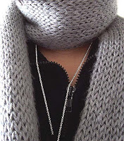
c.) scarves - at first acquired because of necessity. although now i can't imagine what kind of necessity would require a person to have seven scarves.


(left: a christmas present.)

Wednesday, December 3, 2008

Movie Feedback

This is the feedback I received on my show opener.


About the opener:
My goal with the concept of "Dr. Hydrogen's Atomic Comic Hour" is to have a show that appeals to fans of the comic book industry - whom range from the young to the old. I came up with the idea of  superhero/host type personality Dr. Hydrogen as a guide of sorts for both long-time fans and newcomers to the culture. Every week, Dr. Hydrogen leads viewers through numerous aspects of the comic book industry, whether it be current trends, looks behind the scenes, or tips from the artists.
I chose music that I felt evoked the feel of comic book drama, similar to the old-school tv show themes.

Wednesday, November 19, 2008

vis lang:: infographic base sketch

bare model
model with annotations
model with annotations + images

Friday, November 14, 2008

Tuesday, November 11, 2008

sound+motion:: opening research


I'm definitely very interested in pursuing a television opener piece for this project - I feel that this option would suit my topic of comic books more; a data presentation would take a far too logical approach to superheroes and the like, which could alienate its intended audience.

Purpose: television openers serve a number of different purposes - whether it be to draw the attention to the show, or introduce its main actors / characters. They can also help to set the tone of what the show is about, whether it be by virtue of music used, or perhaps narration.

Context: An opener's context would definitely be the shows that appear before and after it. It can be likened to a clapperboard in filming, it signifies to viewers that a new show it starting. It also definitely resides within the sea of advertisements and commercials that are everywhere in TV land.

Audience: Viewers of something like this would most likely be fans of comic books, either looking to learn more about comic books in general, or want to bask in the nerdiness.


Some media I've been looking at:

comm models: object postcard

Finished postcard:


Iterations:


Don't read this yet, Veronica

Veronica's first postcard had a very negative tonality to it, and I was interested in pursuing this atmosphere. I began this part of the process by thinking about negative connotations which could be associated with bras and the like - one particular idea being restriction and the notion of being "chained."


Monday, November 10, 2008

sound&motion:: nonlinear flash process

During the initial stages of this project, I started by looking at different examples of my source material: comic books. Materials which I looked at included classic comic books such as X-Men, Captain America, Spiderman, webcomics such as Looking for Group, Ctrl+Alt+Del, or Penny Arcade, or flash websites such as Eco Zoo.


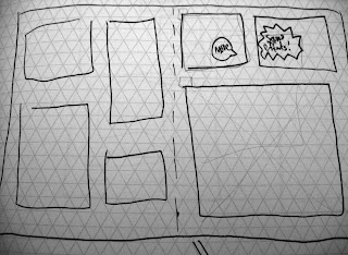
Some of the ideas I played around with in these sketches included a comic book spread layout, or one which consisted of a pile of comic books; with panels which could be interacted with.


I later moved onto color tests and layout tryouts in Flash and Illustrator. After the flash demo, I was able to quickly realized exactly what kinds of object-user interaction I was able to do, given my limited knowledge of Actionscript 3.0

One of my first directions, where the objects I had were arranged into a comic book strip form.
Playing with the layout some more.
Over the course of the last few days, I decided to rework my layout into a more open form: that of an artist's desk, cluttered with items you might find associated with comic book nerds and the like. I liked this approach more because it not only grants the viewer a more open setting, but my objects didn't feel as "confined" compared to when I simple had them set into square frames.


At this stage, I was tinkering around with different objects present on the stage, as well as the overall layout and arrangement.

Final project arrangement.

Tuesday, October 14, 2008

vis lang:: final posters


With my first poster, I chose to use a modernized parody of jianzhi, or the chinese art of paper cutting. Papercraft works such as these have often been used to decorate homes and doors during festivities; but more importantly, they often reflect many aspects of life such as prosperity, health or harvest. Additionally, they can also represent stories about the happiness gained from the accomplishment of common goals. Thus, it is this feature that I wanted to play upon with my poster design. The colors red and gold were also deliberately chosen because of their symbolic meaning. The former representing fortune or good luck, the latter refering to wealth and happiness.


My second poster was inspired by mahjong, a popular game played by the young and the old. The game is also a metaphor for many things, such as one's city or home (referenced by how the tiles are stacked into four walls at the start of the game.) Thus I tried to use mahjong itself as an allegory for voting itself. The tiles, when still face-down (with their green sides showing) represent unrealized potential, and one doesn't know what part it may play in the game.

vis lang:: documentation


Monday, October 13, 2008

sound&motion::final product


This project was definitely an interesting exploration on capturing motion, whether it be by virtue of digital or hand-generated means. It also forced me to consider the verbs and actions that I had chosen, and whether the way I portrayed them had to be literal, or abstracted in some way. Regardless of what solution I came up with, I also hoped to keep it still visually legible.

For my final animation here, I initially wanted to compose it entirely as a stop motion piece - but then gravitated towards trying to blend together both digital and analog means of animation. Working with the flash tools allowed for more fluid transitions and tweens, but I definitely also appreciate how less restrictive analog media can be - hence the presence of both here. And I guess in conclusion, I hope the two approaches might result in a harmonious blend to convey my three actions of sketching, ripping, and crumpling.


Questions:

1.) does the transition between analog and digital media distract from the three actions?

2.) would perhaps a less literal representation of the actions have been more interesting/insightful?

3.) Overall legibility of the narrative.

Wednesday, October 8, 2008

sound&motion:: animation

reworked some of the sketching animation since last class, along with the crumple finale.

vis lang :: poster directions