Wednesday, December 3, 2008

Movie Feedback

This is the feedback I received on my show opener.


About the opener:
My goal with the concept of "Dr. Hydrogen's Atomic Comic Hour" is to have a show that appeals to fans of the comic book industry - whom range from the young to the old. I came up with the idea of  superhero/host type personality Dr. Hydrogen as a guide of sorts for both long-time fans and newcomers to the culture. Every week, Dr. Hydrogen leads viewers through numerous aspects of the comic book industry, whether it be current trends, looks behind the scenes, or tips from the artists.
I chose music that I felt evoked the feel of comic book drama, similar to the old-school tv show themes.

Wednesday, November 19, 2008

vis lang:: infographic base sketch

bare model
model with annotations
model with annotations + images

Friday, November 14, 2008

Tuesday, November 11, 2008

sound+motion:: opening research


I'm definitely very interested in pursuing a television opener piece for this project - I feel that this option would suit my topic of comic books more; a data presentation would take a far too logical approach to superheroes and the like, which could alienate its intended audience.

Purpose: television openers serve a number of different purposes - whether it be to draw the attention to the show, or introduce its main actors / characters. They can also help to set the tone of what the show is about, whether it be by virtue of music used, or perhaps narration.

Context: An opener's context would definitely be the shows that appear before and after it. It can be likened to a clapperboard in filming, it signifies to viewers that a new show it starting. It also definitely resides within the sea of advertisements and commercials that are everywhere in TV land.

Audience: Viewers of something like this would most likely be fans of comic books, either looking to learn more about comic books in general, or want to bask in the nerdiness.


Some media I've been looking at:

comm models: object postcard

Finished postcard:


Iterations:


Don't read this yet, Veronica

Veronica's first postcard had a very negative tonality to it, and I was interested in pursuing this atmosphere. I began this part of the process by thinking about negative connotations which could be associated with bras and the like - one particular idea being restriction and the notion of being "chained."


Monday, November 10, 2008

sound&motion:: nonlinear flash process

During the initial stages of this project, I started by looking at different examples of my source material: comic books. Materials which I looked at included classic comic books such as X-Men, Captain America, Spiderman, webcomics such as Looking for Group, Ctrl+Alt+Del, or Penny Arcade, or flash websites such as Eco Zoo.


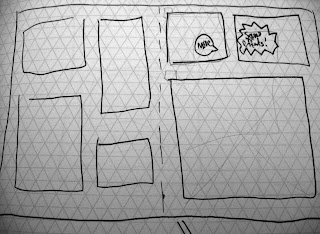
Some of the ideas I played around with in these sketches included a comic book spread layout, or one which consisted of a pile of comic books; with panels which could be interacted with.


I later moved onto color tests and layout tryouts in Flash and Illustrator. After the flash demo, I was able to quickly realized exactly what kinds of object-user interaction I was able to do, given my limited knowledge of Actionscript 3.0

One of my first directions, where the objects I had were arranged into a comic book strip form.
Playing with the layout some more.
Over the course of the last few days, I decided to rework my layout into a more open form: that of an artist's desk, cluttered with items you might find associated with comic book nerds and the like. I liked this approach more because it not only grants the viewer a more open setting, but my objects didn't feel as "confined" compared to when I simple had them set into square frames.


At this stage, I was tinkering around with different objects present on the stage, as well as the overall layout and arrangement.

Final project arrangement.

Tuesday, October 14, 2008

vis lang:: final posters


With my first poster, I chose to use a modernized parody of jianzhi, or the chinese art of paper cutting. Papercraft works such as these have often been used to decorate homes and doors during festivities; but more importantly, they often reflect many aspects of life such as prosperity, health or harvest. Additionally, they can also represent stories about the happiness gained from the accomplishment of common goals. Thus, it is this feature that I wanted to play upon with my poster design. The colors red and gold were also deliberately chosen because of their symbolic meaning. The former representing fortune or good luck, the latter refering to wealth and happiness.


My second poster was inspired by mahjong, a popular game played by the young and the old. The game is also a metaphor for many things, such as one's city or home (referenced by how the tiles are stacked into four walls at the start of the game.) Thus I tried to use mahjong itself as an allegory for voting itself. The tiles, when still face-down (with their green sides showing) represent unrealized potential, and one doesn't know what part it may play in the game.

vis lang:: documentation


Monday, October 13, 2008

sound&motion::final product


This project was definitely an interesting exploration on capturing motion, whether it be by virtue of digital or hand-generated means. It also forced me to consider the verbs and actions that I had chosen, and whether the way I portrayed them had to be literal, or abstracted in some way. Regardless of what solution I came up with, I also hoped to keep it still visually legible.

For my final animation here, I initially wanted to compose it entirely as a stop motion piece - but then gravitated towards trying to blend together both digital and analog means of animation. Working with the flash tools allowed for more fluid transitions and tweens, but I definitely also appreciate how less restrictive analog media can be - hence the presence of both here. And I guess in conclusion, I hope the two approaches might result in a harmonious blend to convey my three actions of sketching, ripping, and crumpling.


Questions:

1.) does the transition between analog and digital media distract from the three actions?

2.) would perhaps a less literal representation of the actions have been more interesting/insightful?

3.) Overall legibility of the narrative.

Wednesday, October 8, 2008

sound&motion:: animation

reworked some of the sketching animation since last class, along with the crumple finale.

vis lang :: poster directions


Tuesday, September 23, 2008

vis lang:: rhetoric - audience

although initially hesitant about choosing this demographic, i've decided to go with chinese americans for our current project. specifically, the younger generations - a thoroughly modern group, but still very much grounded in the teachings and traditions of their parents and ancestors. and although chinese americans share a high socioeconomic status in american society, they are inactive in politics or local affairs. thus, it is with this project that i hope to explore some of the reasons behind this political apathy, find an entity that many could identify with, and encourage more political activism within this demographic.

1. what are some predominately shared values of this group?
education and family values, tempered with a sense of tradition, respect, and not a little bit of honor.


2. what political policies/issues are particularly important to this demographic in this election? why?
immigration, health care, education, etc

3. are there any cultural references your demographic identifies with? what?
amy tan, margaret cho, b.d. wong, stephen chow, etc.

as with any demographic, it is not without its fair share of stereotypes; and they range from the endearing to the downright derogatory. one in particular that i remember well occurred in an episode of scooby doo, when two of the main protagonists evaded the bad buys by pretending to be chinese. how? by putting on robes and having buck teeth. enter the hideously stereotyped chinese waiter.
there are many things in our culture which are supposed to evoke an "asian" feel to them, whether it be chinese dresses (cheongsam) or chopsticks in ones hair (which is actually a major faux pas), etc

4. what does their graphic landscape look like?


5. including the aiga document and other sources, what are the issues cited for this group not
voting?
there's definitely a cultural gap between this demographic and the candidates running. numerous other reasons have been cited as well - too busy, out of town, voter registration problems, etc- but political apathy is definitely a major issue here.


sources:
"why do chinese-americans avoid politics? a study of social isolation" - all academic research.com
"chinese americans" - http://en.wikipedia.org/wiki/Chinese_American
http://www.hyphenmagazine.com/